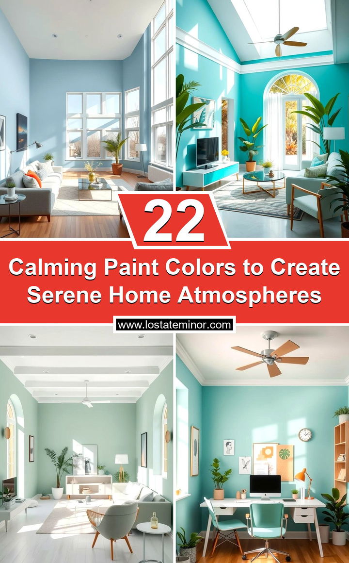
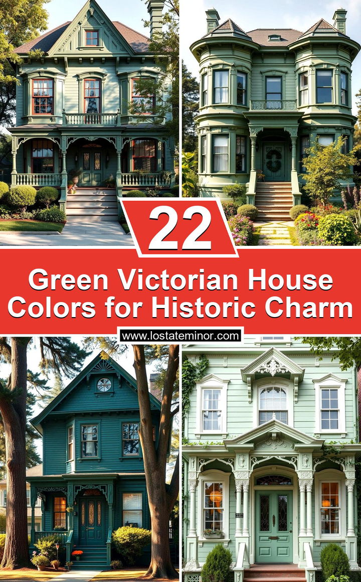
An appealing atmosphere begins with a deep understanding of how color influences our moods and surroundings. Calming paint colors are more than trendy choices—they create serene spaces that inspire relaxation and clarity in our busy lives. Every shade has the potential to transform a room, making environments feel brighter, cozier, and tranquil. Guided by expertise and genuine care for your well‐being, the following ideas showcase unique hues designed to soothe and rejuvenate your senses. Embrace the journey and explore 22 Calming Paint Colors to discover a palette that resonates with your inner peace.
1. Tranquil Soft Blue
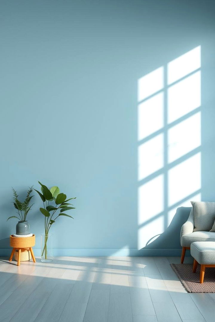
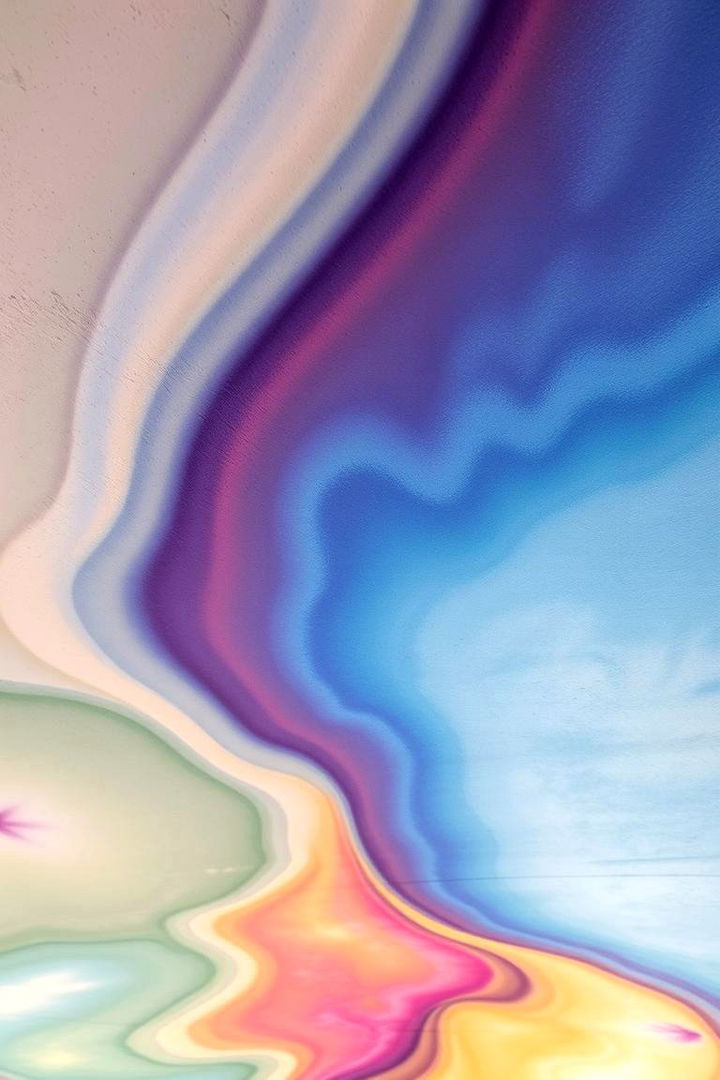
A soft blue envelops your space like a clear summer sky, inviting a sense of calm and relaxation. This tranquil hue mirrors the soothing quality of early morning light and promises to make any room feel expansive and serene. Its gentle tone can enhance concentration and create a peaceful canvas for restful moments. With vibrant yet understated appeal, Tranquil Soft Blue is perfect for bedrooms, living areas, or any place where you need a break from everyday stress. Enjoy the natural benefits of cool serenity and refresh your surroundings with calm elegance.
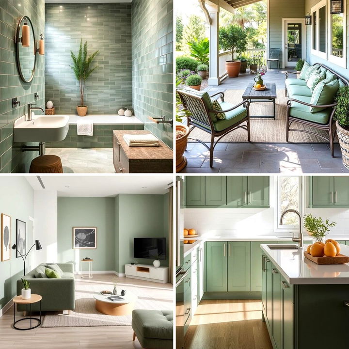
2. Serene Seafoam Green
Surprisingly, seafoam green brings nature’s restorative energy indoors, invoking the refreshing touch of ocean breezes and soft coastal landscapes. This calming color establishes a link between the indoors and the outdoors, creating a deep sense of balance and renewal. Its delicate, muted vibrancy has the unique power to soften spaces and reduce anxiety while enhancing overall wellbeing. Ideal for kitchens, bathrooms, or personal sanctuaries, this hue adds gentle sophistication and peaceful liveliness. Embrace the soothing effects and let Serene Seafoam Green transform your environment into a tranquil retreat.
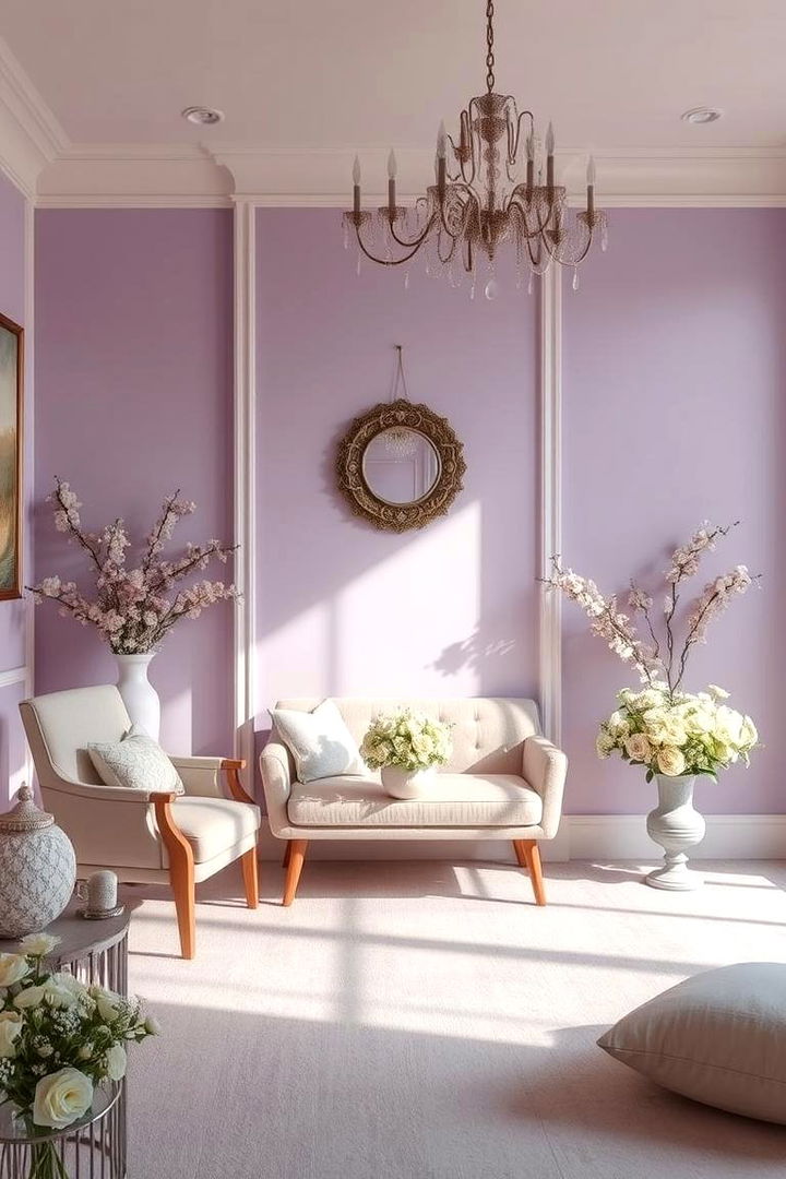
3. Gentle Pastel Lavender
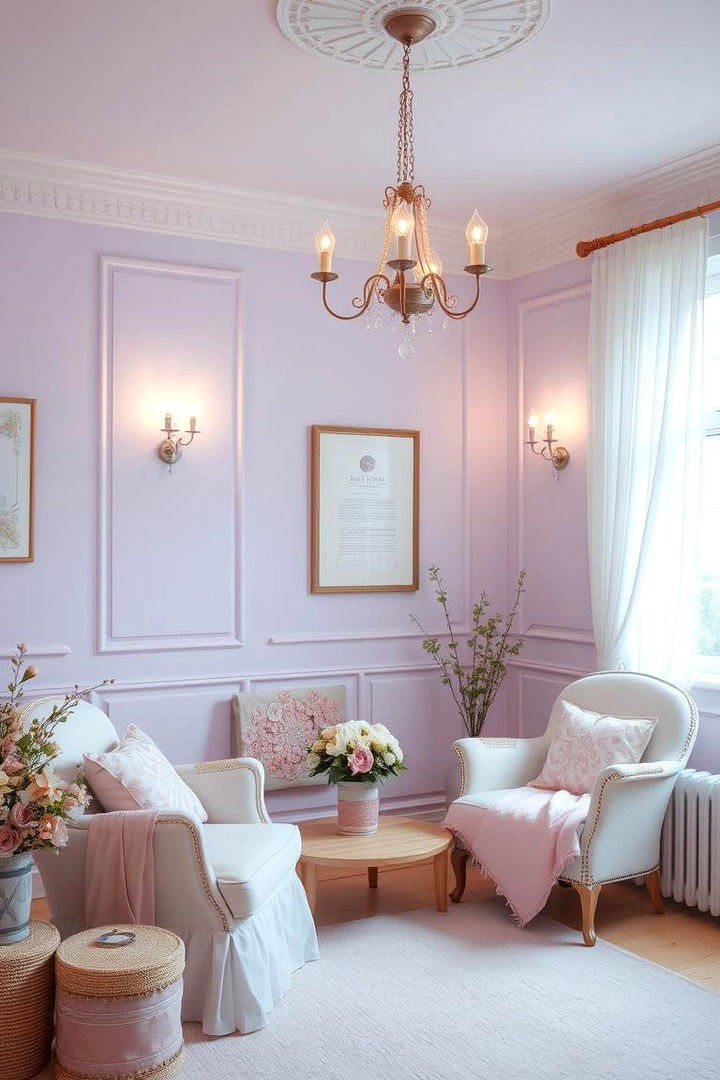
What could be more soothing than a gentle wash of pastel lavender that wraps your room in a delicate, calming embrace? This soft, warm hue exudes a sense of quiet luxury and allure, evoking images of blooming spring gardens and enchanted twilight hours. Its subtle elegance makes it well-suited for bedrooms and relaxation spaces where stress relief is key. Pastel lavender helps reduce tension and encourages restful sleep while adding a dreamy, romantic feel to interiors. Discover the understated charm and peace that Gentle Pastel Lavender can bring to your favorite room.
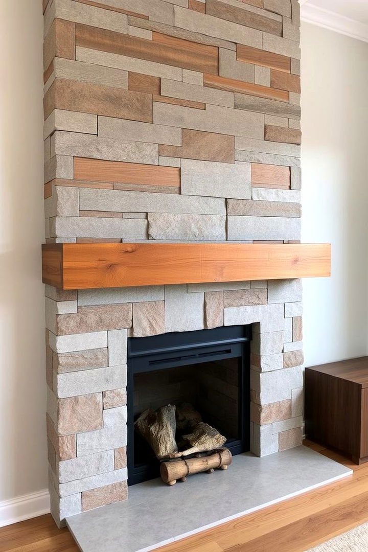
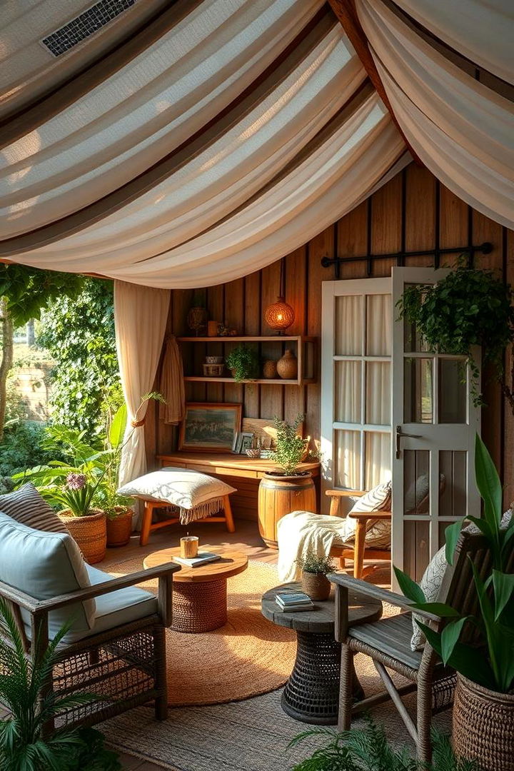
4. Warm Sand Beige
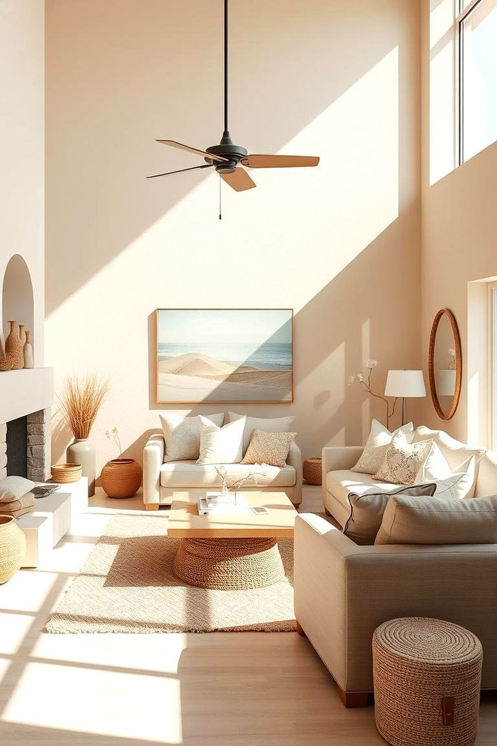
With warm sand beige, imagine stepping into a serene coastal haven where the gentle hues of nature calm both the eyes and the mind. This soothing neutral creates an inviting ambiance, offering a soft backdrop that enhances any decor style. Its natural warmth and understated elegance evoke images of sunlit shores and quiet desert landscapes. Perfect for living spaces and hallways, Warm Sand Beige effortlessly lightens and harmonizes the overall atmosphere. This color not only relaxes the senses but also provides an adaptable base for various accent hues with ease.
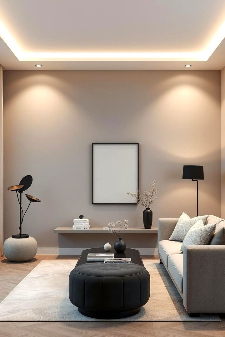
5. Misty Grey
The understated beauty of Misty Grey casts a peaceful spell over any room by blending modern sophistication with natural calm. Its balanced tone is reminiscent of quiet, overcast days that invite introspection and a gentle slowing of pace. Ideal for contemporary settings, Misty Grey creates a timeless backdrop that supports a range of decorative styles. This versatile hue works well in offices, bedrooms, or any area requiring a stress-free environment. The soft neutrality of Misty Grey allows you to emphasize textures and accents while maintaining an overall aura of calm and refined elegance.
6. Soothing Mint Green
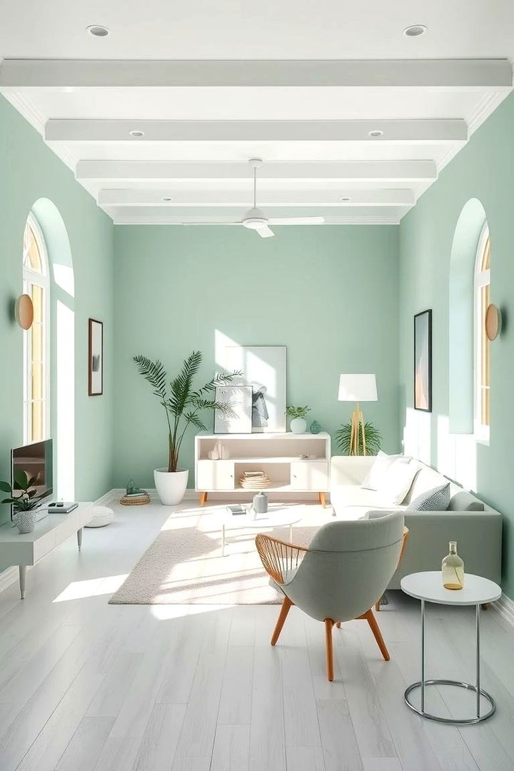
Imagine the vivid yet soothing chill of Soothing Mint Green that instantly revitalizes your space with its crisp, refreshing energy. This light, airy color conjures images of dew-kissed mornings and cool, calming breezes. Its subtle vibrancy subtly encourages relaxation, reducing anxiety while infusing interiors with a sense of renewal. Perfect for bathrooms, workspaces, and creative studios, Soothing Mint Green lends a fresh perspective to your décor. The crispness of this hue pairs impeccably with both modern and classic elements, creating a harmonious balance that resonates with natural vitality.
7. Calm Sky Blue
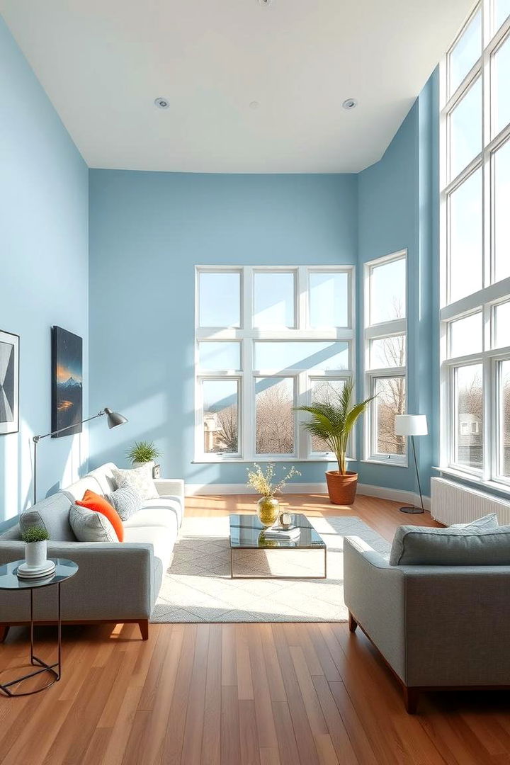
A calm sky blue evokes the expansive tranquility of a clear horizon, wrapping your space in an aura of endless serenity. This light, refreshing color steadily reduces stress and fosters a peaceful, uplifting environment. Its expansive nature creates visual depth, making rooms appear larger and more inviting than ever before. Ideal for bedrooms and study areas, Calm Sky Blue directs focus toward inner balance and gentle rejuvenation. The hue’s inherent softness encourages relaxation, bridging a connection with the natural skies to create an enduring sense of calm and clear-minded reflection.
8. Delicate Blush Pink
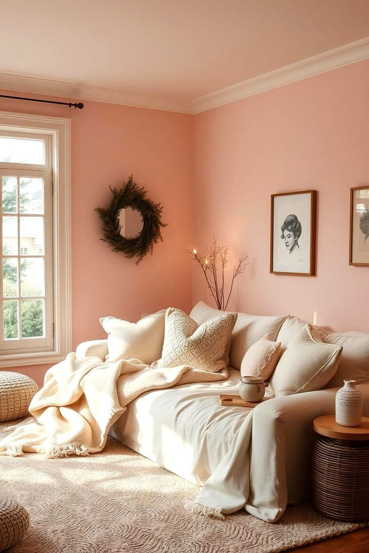
Surprisingly gentle, Delicate Blush Pink brings warmth and quiet sophistication to spaces that crave serene charm. This soft, tender hue is reminiscent of early morning roses and subtle sunsets, offering a comforting embrace that soothes the spirit. It infuses rooms with a refined elegance and an understated allure that promotes emotional well-being. Perfect for bedrooms, nurseries, and cozy living spaces, Delicate Blush Pink softens edges while adding a sweet note of optimism. Embrace this color’s quiet grace and let it nurture an atmosphere of gentle tranquility and inviting warmth.
9. Subtle Green Tea
With Subtle Green Tea, experience the deep roots of nature manifested in a color that whispers calm and reassurance. This delicate hue carries the organic warmth of tea leaves infused with hints of citrus, crafting an invigorating yet serene ambiance. Often associated with balance and rejuvenation, Green Tea leaves spaces feeling energizing while calming the spirit. Ideal for dining areas or home offices, this shade pairs naturally with both light and dark accents. Infuse your home with a touch of calm vitality and embrace the restorative energy of Subtle Green Tea ambiance.
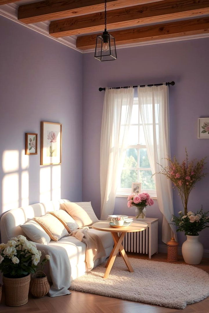
10. Peaceful Lilac
Imagine a peaceful lilac hue that softens spaces with its charming blend of subtle purple tones and tranquil grace. This inviting color brings an element of quiet magic to interiors, reminiscent of serene spring mornings filled with gentle floral aromas. Its calming presence encourages relaxation and emotional balance, making it a perfect choice for bedrooms, reading nooks, or meditation spaces. The unique tone of Peaceful Lilac adds a whisper of elegance while soothing the senses. Embrace its soft allure to create a space where every moment feels as tender and luminous as a blossoming garden.
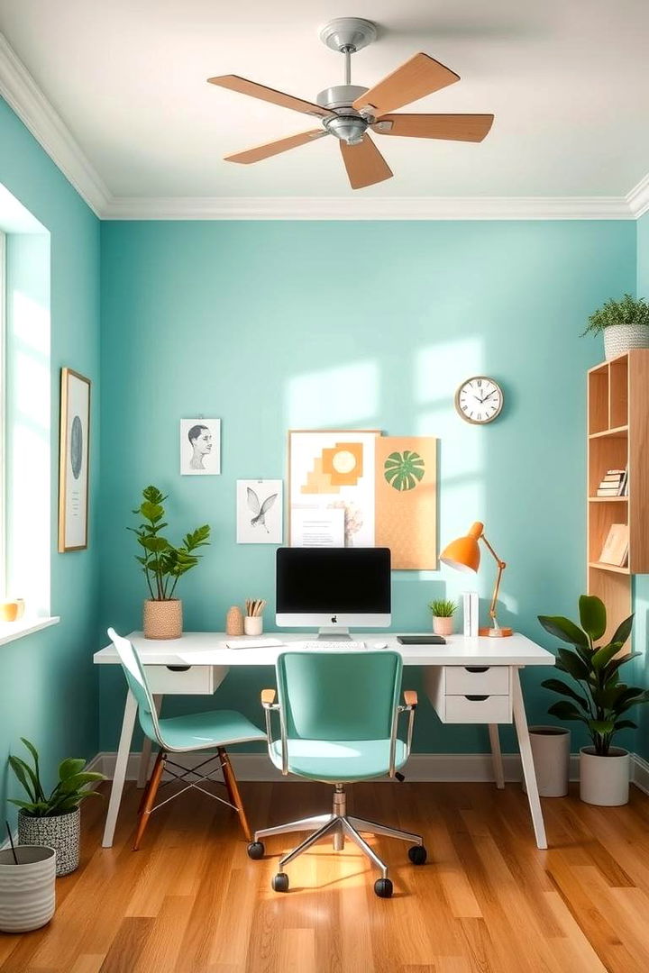
11. Refreshing Aqua
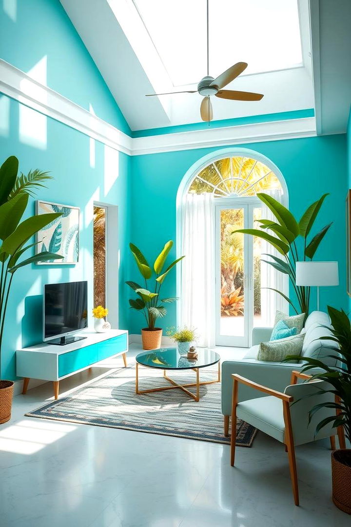
A refreshing aqua washes over your interiors with the invigorating clarity of cool water and bright tropical vibes. This luminous color blends hints of blue and green to evoke a sense of both calm and renewed energy. Its vivid yet soothing tone is ideal for spaces where creativity and relaxation converge, such as bathrooms or creative workspaces. Refreshing Aqua provides an environment ripe for rejuvenation and mental clarity, encouraging both calm and inspiration. Embrace the delightful balance this hue offers, bringing a dynamic mix of fresh optimism and tranquil depth to your décor.
12. Cozy Cream
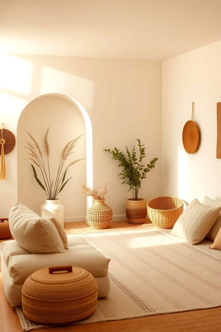
With warm and inviting undertones, Cozy Cream wraps your space in a blanket of gentle calm and understated luxury. This soft neutral radiates comfort and versatility, providing a perfect backdrop that enhances various décor styles while maintaining soothing simplicity. Its creamy hue imparts a sense of timeless elegance, turning living rooms and bedrooms into serene retreats. The understated warmth of Cozy Cream encourages relaxation and peaceful introspection, making it ideal for spaces where you unwind. Enjoy the natural harmony and refined beauty this color adds, seamlessly merging calm with classic charm.
13. Serene Dove Grey
A refined shade like Serene Dove Grey casts a quiet elegance that is both balanced and deeply calming. This muted tone, reminiscent of soft feathered hues, enhances interiors with a touch of modern simplicity and timeless appeal. Its gentle neutrality creates a soothing background ideal for a range of decorative ideas in living rooms or bedrooms. Maintaining a perfect balance between warmth and cool, Serene Dove Grey encourages relaxation and a subtle sophistication. This color offers the perfect canvas for both minimalist and bold accent elements, ensuring a harmonious, stress-free environment.
14. Light Chamomile Yellow
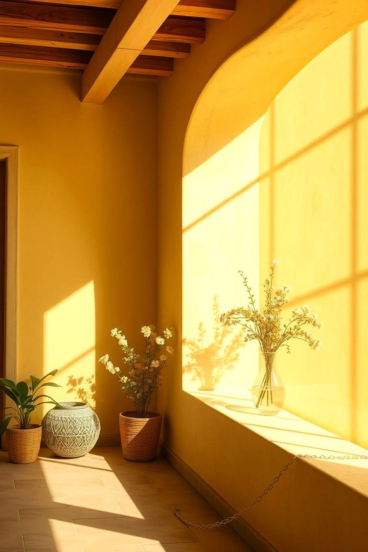
Surprisingly uplifting Light Chamomile Yellow transforms any room with its gentle radiance and warm, inviting glow. This muted yellow, as soft as a sunlit morning, infuses spaces with a tender optimism. Its delicate brightness is perfect for dining or reading areas where a subtle boost of energy is needed without overwhelming the senses. The color reflects natural health and serenity, lending a calm yet cheerful ambiance that invites relaxation. Embrace Light Chamomile Yellow to energize your space gently while maintaining an overall aura of serene balance and heartfelt comfort.
15. Soft Turquoise
Imagine soft turquoise whispering serene tales of tropical retreats and quiet ocean down days into your interiors. This enchanting yet calming color bridges the gap between the refreshing qualities of blue and the uplifting expressiveness of green. Soft Turquoise enhances any room by infusing energy in a balanced, soothing manner, making it ideal for living areas or creative spaces needing a gentle spark of inspiration. Its distinctive yet subtle vibrancy provides the perfect antidote to a stressful day. Let this hue transform your space into a peaceful oasis filled with natural wonder and refreshing calm.
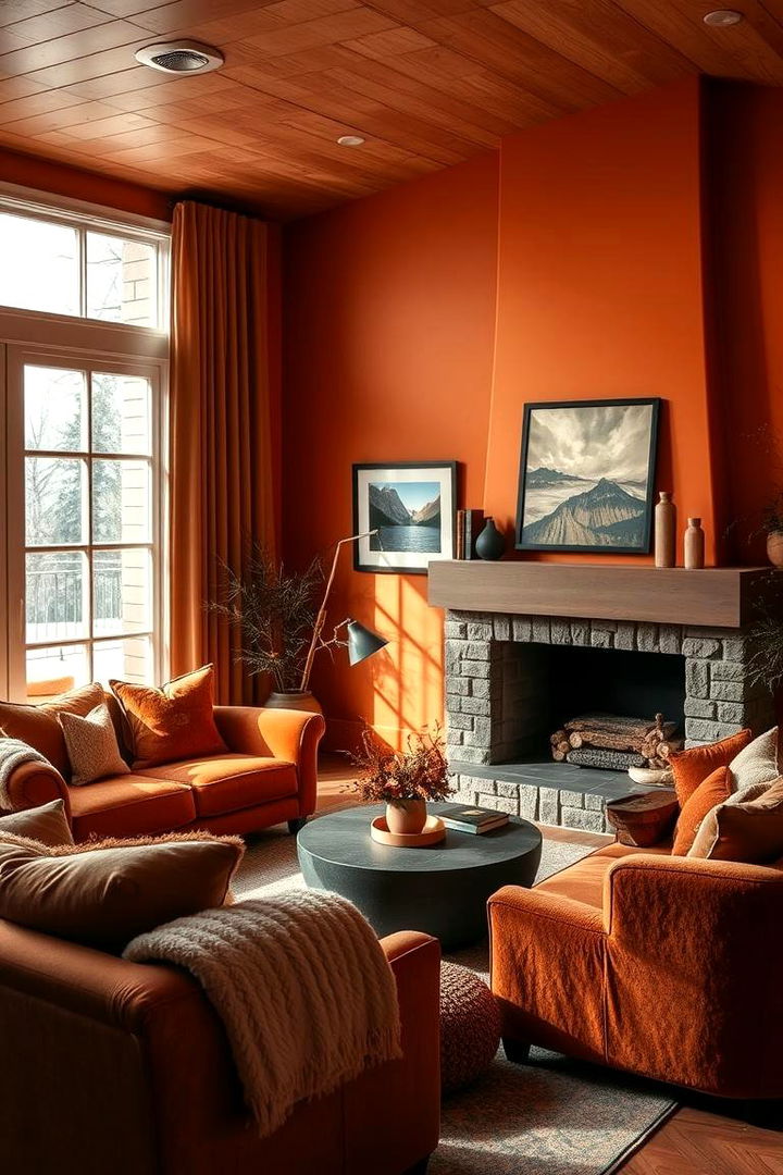
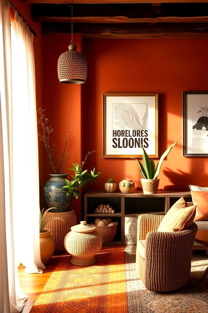
16. Quiet Coral
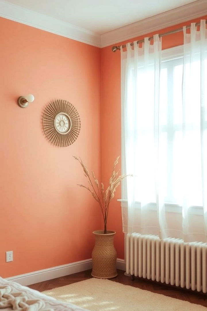
Quiet Coral introduces a tranquil twist on traditional coral shades by exuding an understated warmth and gentle vibrancy. This muted tone captivates with its soft balance of pink and orange hues, infusing environments with a sense of comfort and serenity. The color is ideal for accent walls or small spaces where a hint of cheer is needed without the intensity. Quiet Coral nurtures a calming atmosphere and boosts positive energy, making it perfect for living rooms or bedrooms. Enjoy the nuanced sophistication and subtle delight that Quiet Coral brings to your interiors, transforming everyday spaces into peaceful retreats.
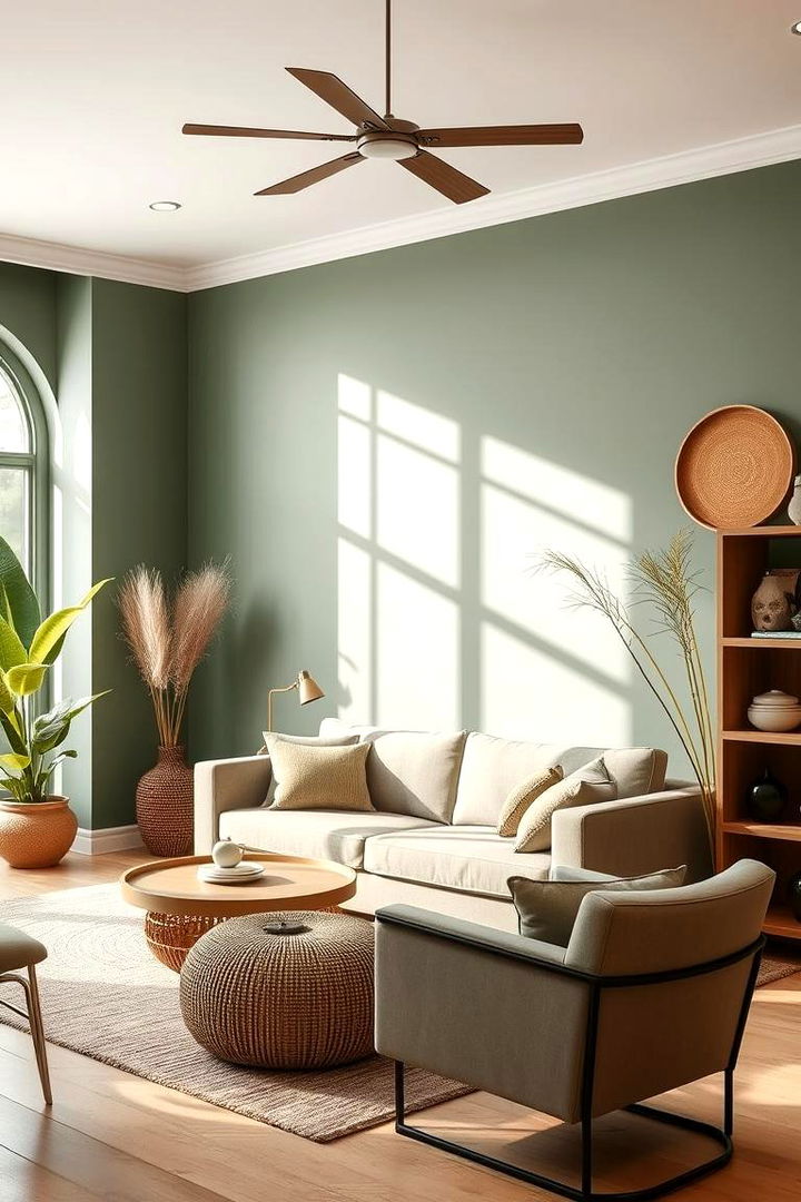
17. Gentle Olive
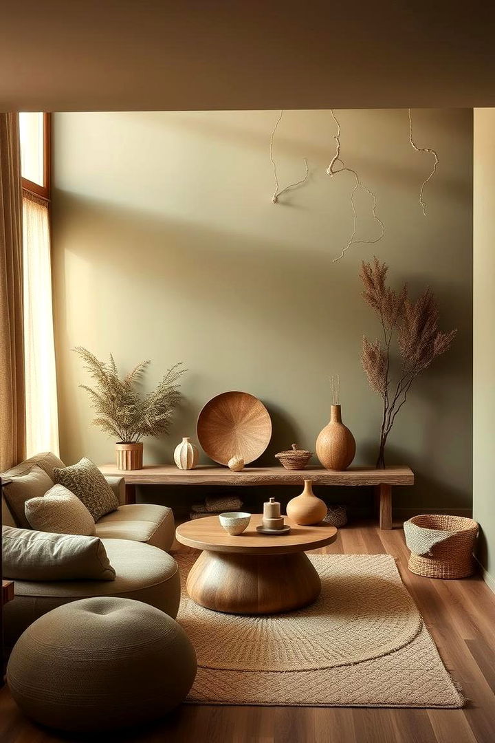
Bringing natural earthiness indoors, Gentle Olive creates an environment that exudes calm sophistication and organic vitality. This quiet, muted green offers a refined connection to nature, reminiscent of serene olive groves and soft forest lighting. Its balanced tone helps reduce mental clutter and enriches spaces with understated charm, making it ideal for kitchens, studies, and lounges. Gentle Olive provides a grounding effect without overpowering other design elements, ensuring a harmonious, stress-free ambiance throughout your home. Embrace the elegant subtlety and timeless calm this hue brings to your decor.
18. Delicate Periwinkle
Although often overlooked, Delicate Periwinkle has a unique charm that bridges the comfort of blue with a whisper of purple allure. This soothing color embodies a gentle dreaminess, perfect for spaces designed to spark creativity and calm the mind simultaneously. Its soft intensity creates a balanced environment that enhances serenity and invites relaxation in rooms like bedrooms or quiet lounges. The subtle vibrancy of Delicate Periwinkle uplifts without overwhelming, imparting a refined sense of tranquility. Let this enchanting hue add a spark of imaginative calm and timeless beauty to your personal sanctuary.
19. Muted Mauve
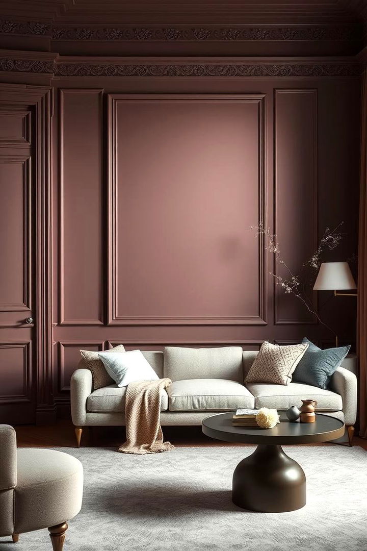
Surprisingly refined, Muted Mauve infuses interiors with a soft, calming warmth that gently soothes the spirit. This understated hue offers a delicate blend of pink and purple nuances, creating a perfect balance between vibrancy and relaxation. Its subtle charm transforms spaces into serene retreats where stress recedes and gentle calm prevails. Ideal for bedrooms or intimate reading spaces, Muted Mauve enhances the atmosphere without overpowering other accents. Enjoy the sophisticated blend of comfort and understated luxury, and let Muted Mauve provide a nurturing backdrop for quiet moments of reflection and creative inspiration.
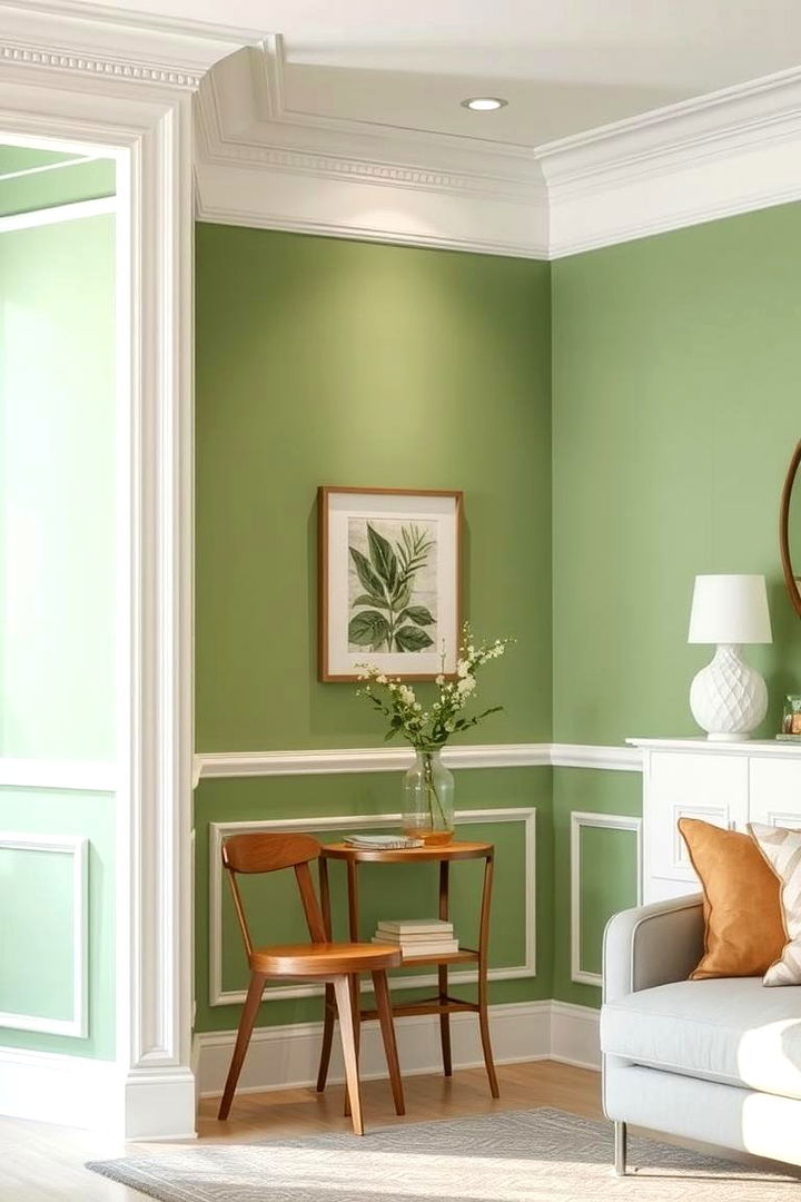
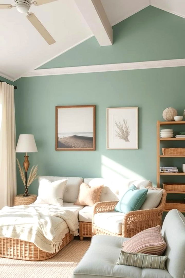
20. Harmonious Sage
With a natural allure reminiscent of lush herb gardens and serene landscapes, Harmonious Sage creates an atmosphere of organic calm and balance. This refined green exudes a soothing energy that brings a sense of groundedness and renewal to interiors. Its muted, earthy tones work beautifully in living areas and offices, promoting clarity and reducing stress. Harmonious Sage pairs effortlessly with both modern and rustic design elements, providing a versatile backdrop for relaxation or creative expression. Experience the therapeutic benefits of nature distilled into one elegant color that lends your space timeless harmony and inviting tranquility.
21. Pure White Tranquility
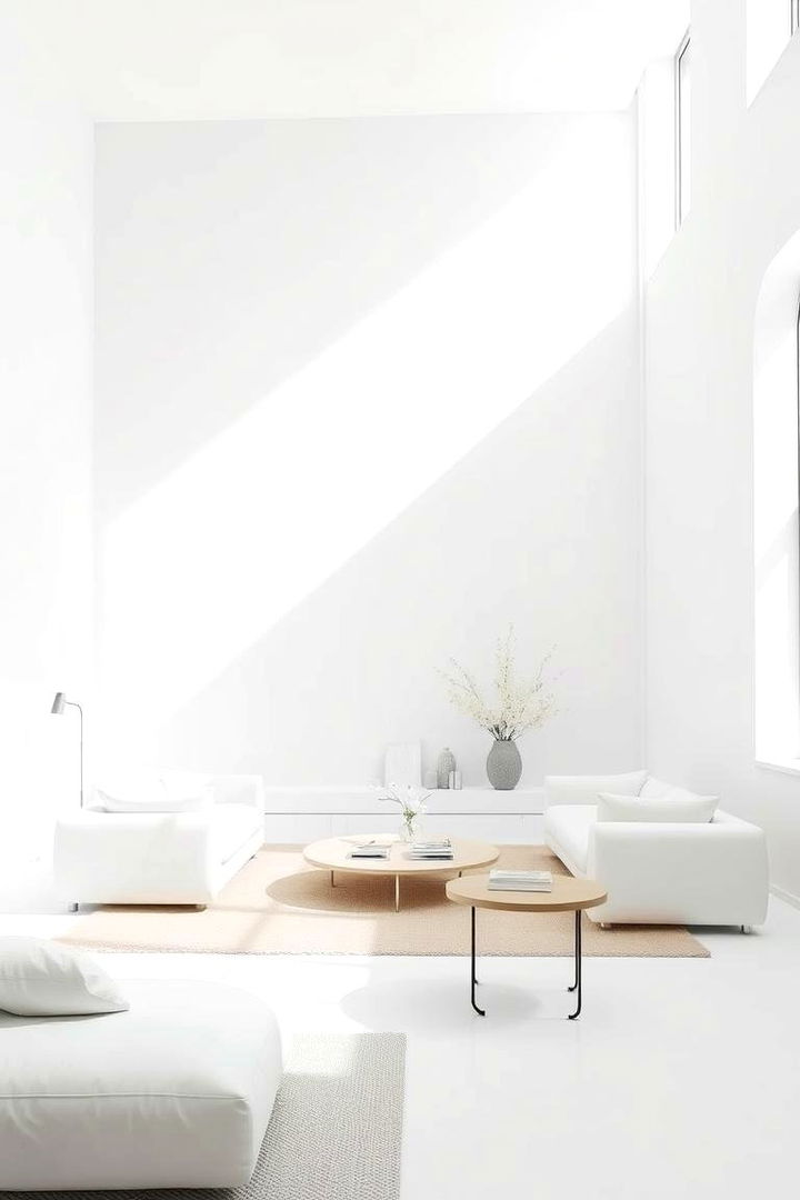
An atmosphere of Pure White Tranquility instantly brightens any space, creating an immaculate canvas that radiates calm and clarity. This pristine shade embraces simplicity and absolute serenity, reminiscent of untouched snow or soft moonlight on a quiet night. Its reflective nature not only enlarges the perception of space but also enhances overall mood by inviting a clean, peaceful vibe. Perfect for modern minimalist décor, Pure White Tranquility harmonizes seamlessly with bolder accents, making every corner of your home feel airy and stress-free. Discover how this timeless hue fosters both peace and sophisticated clarity.
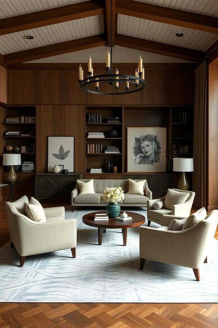
22. Restful Taupe
Bringing an inviting, earthy warmth, Restful Taupe grounds your environment with natural elegance and quiet sophistication. This soft neutral, with its blend of grey and brown undertones, creates a subtle yet impactful atmosphere that calms and centers the mind. Ideal for living rooms, studies, or any space intended for unwinding, Restful Taupe works beautifully as a base for layering textures and accent colors. Its gentle depth helps soften the sharpness of modern designs, inviting emotional balance and refined comfort. Embrace this color’s timeless charm to craft an environment of undisturbed relaxation and genuine warmth.
Conclusion:
The exploration of 22 Calming Paint Colors reveals a diverse array of hues, each imbued with the ability to transform mundane spaces into sanctuaries of peace and rejuvenation. Every color offers unique benefits, from promoting tranquility and enhancing concentration to infusing spaces with natural warmth and balance. The collection not only highlights sophisticated palettes but also renders interior environments more comforting and inviting. Rely on these thoughtful color choices to create intimate retreats and impactful designs that nurture the soul and inspire gentle calm every day.
Related posts: