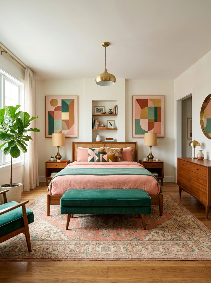
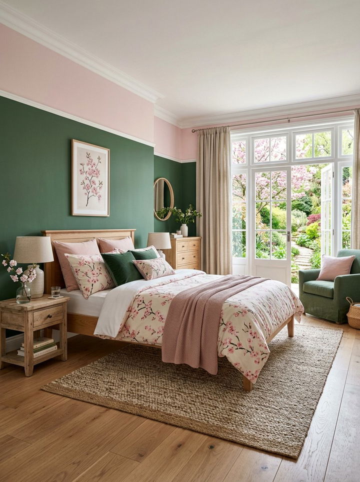
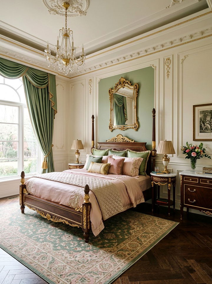
Choosing the perfect color palette for your sleeping sanctuary can feel overwhelming, but the combination of pink and green offers a refreshing and sophisticated solution. These two colors sit opposite each other on the color wheel, making them naturally complementary and visually striking. Whether you prefer a bold tropical vibe or a soft, vintage aesthetic, this duo provides endless versatility for any interior style. From deep forest greens paired with vibrant fuchsias to muted sage tones matched with delicate blush, there is a variation that fits every personality. This guide explores creative ways to balance these hues to create a space that feels both energetic and calming. You will discover how different textures, lighting, and furniture styles can elevate this color pairing to a professional level. Let’s dive into these thirty unique ways to transform your bedroom using this iconic and timeless color combination.
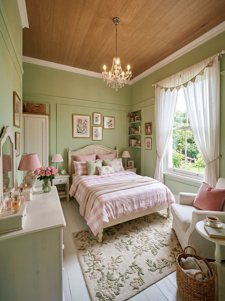
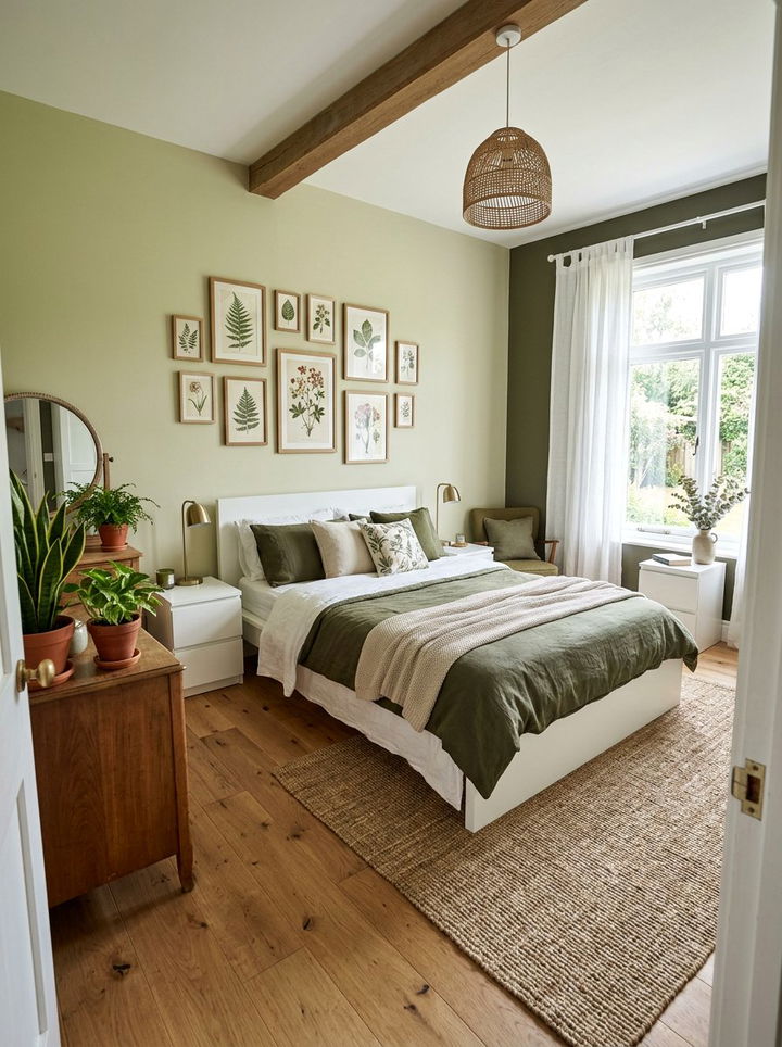
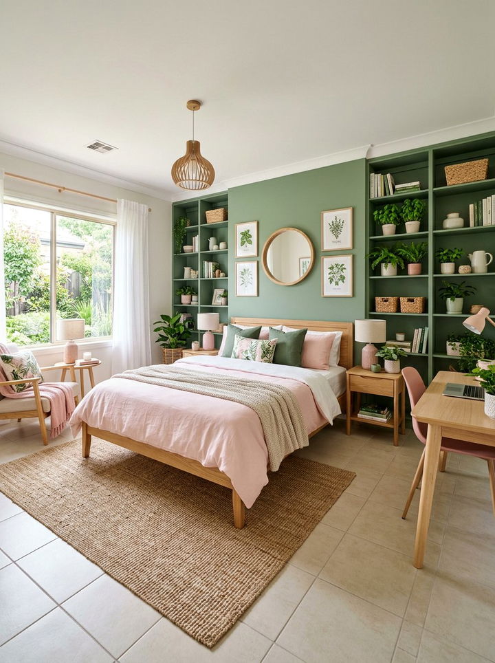
1. Soft sage and blush bedroom
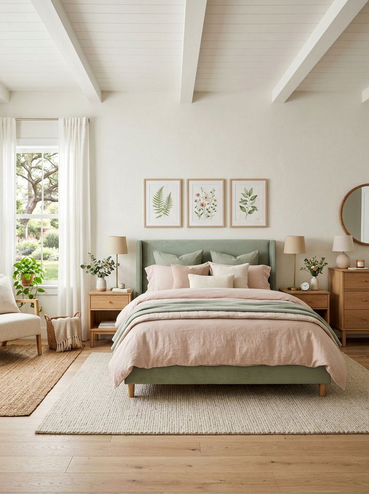
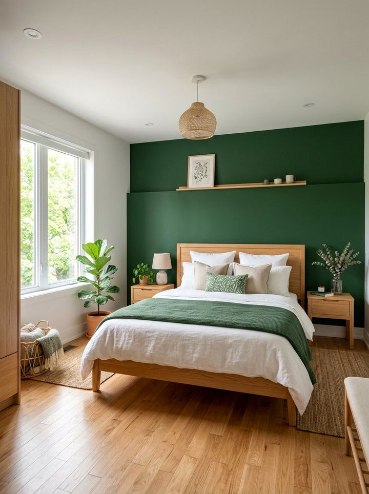
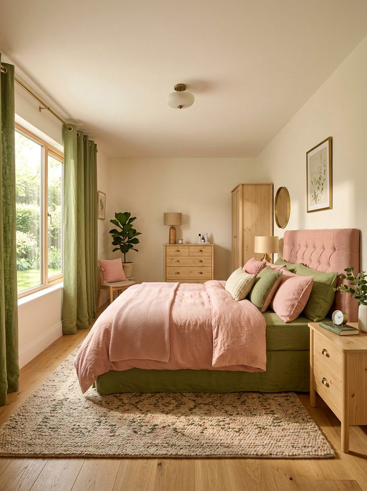
Sage green creates a soothing foundation for any sleep space because of its earthy and grounded nature. When you pair it with soft blush pink, the room feels instantly balanced and refreshed. This specific combination mimics the look of a blooming garden during the early spring season. You can use sage on the main walls to provide a calm atmosphere. Adding blush through linen bedding or velvet accent pillows introduces a necessary touch of warmth and softness. This duo works perfectly for anyone who wants a colorful room that still feels peaceful and quiet. Many modern designers use this palette to create a biophilic sanctuary that feels connected to the natural world. It is a timeless choice that transitions beautifully through different seasons and interior design trends.
2. Emerald green and dusty rose bedroom
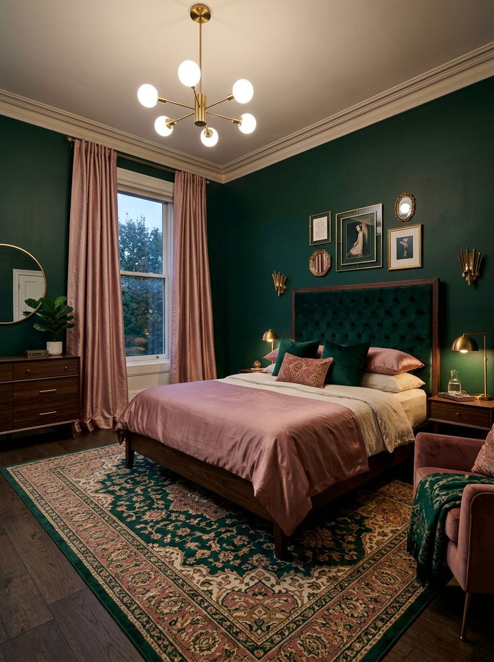
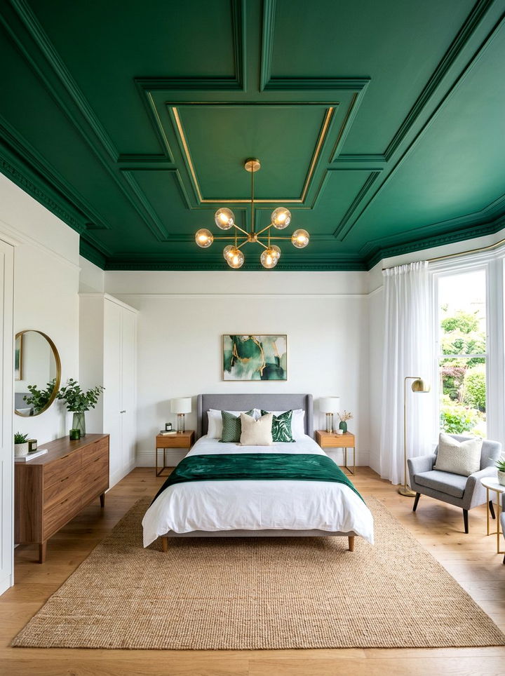
Emerald green is a jewel tone that brings a sense of luxury and drama to a bedroom setting. To soften the intensity of this deep green, you should incorporate dusty rose accents throughout the space. This pairing creates a sophisticated and moody environment that feels very high-end. Use emerald green for a statement velvet headboard or a bold accent wall behind the bed. The dusty rose can be introduced through floor-to-length curtains or a textured area rug. This combination works exceptionally well with metallic accents like gold or brass hardware. The contrast between the dark, cool green and the warm, muted pink creates a visual depth that is hard to achieve with other colors. It is an ideal choice for a primary suite.
3. Mint green and light pink bedroom
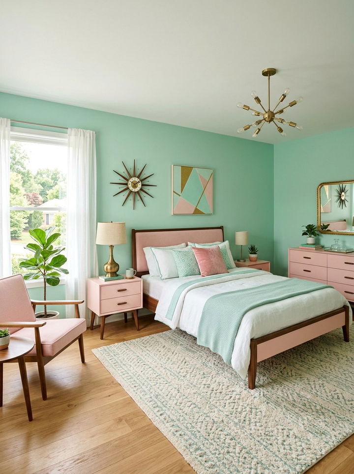
Mint green and light pink offer a playful and nostalgic look that feels bright and airy. This combination is often associated with retro or mid-century modern aesthetics. The cool undertones of mint green keep the room feeling fresh and clean. Adding light pink elements prevents the space from feeling too cold or clinical. You might consider using a mint green paint for the walls and light pink for the furniture pieces. This palette is especially popular for smaller bedrooms because light colors help to make a space feel much larger. To keep it looking modern, try to use clean lines and minimalist decor items. Natural light enhances these colors significantly, making the entire room glow with a cheerful and inviting energy.
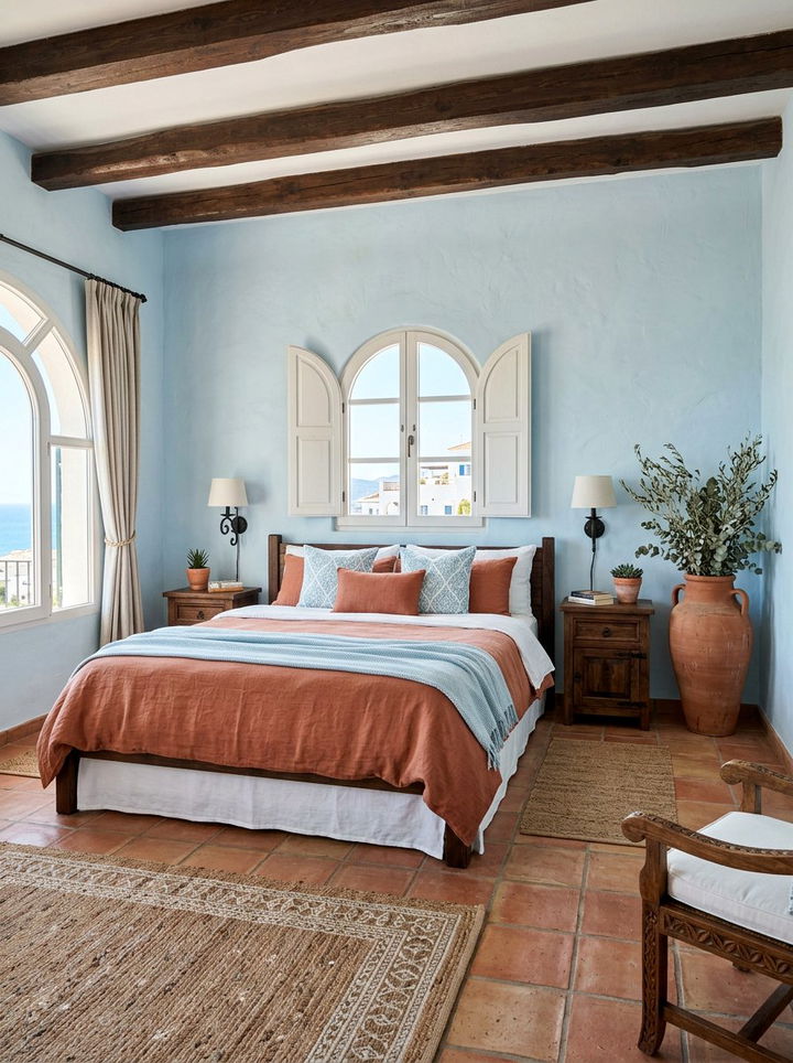
4. Olive green and terracotta pink bedroom
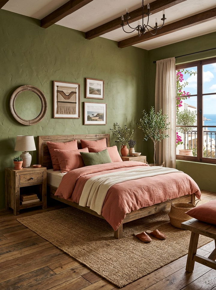
Olive green and terracotta pink create a warm, Mediterranean-inspired atmosphere that feels very cozy. This earthy pairing is perfect for someone who prefers a more natural and organic interior style. Olive green acts as a sophisticated neutral that provides a lot of visual interest without being overpowering. Terracotta pink adds a sun-drenched quality that makes the bedroom feel inviting and snug. You can layer these colors using different fabrics like linen, wool, and cotton to add physical texture. Wooden furniture pieces in medium to dark tones complement this color scheme beautifully. This palette works best in rooms with plenty of natural sunlight to highlight the rich undertones. It creates a rustic yet refined look that feels grounded and very comfortable.
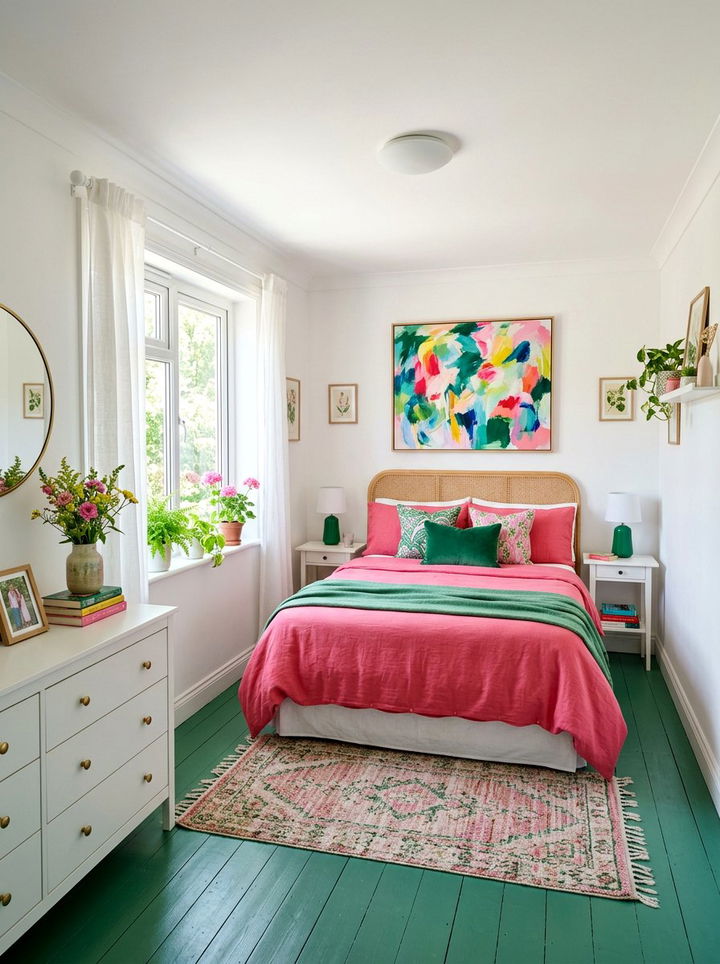
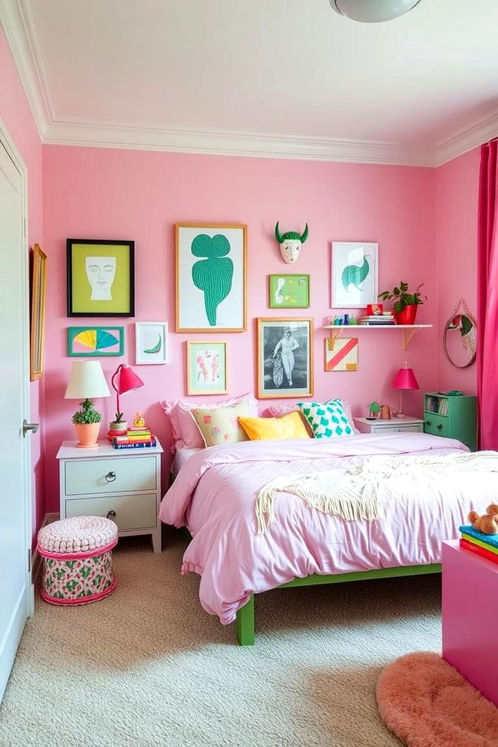
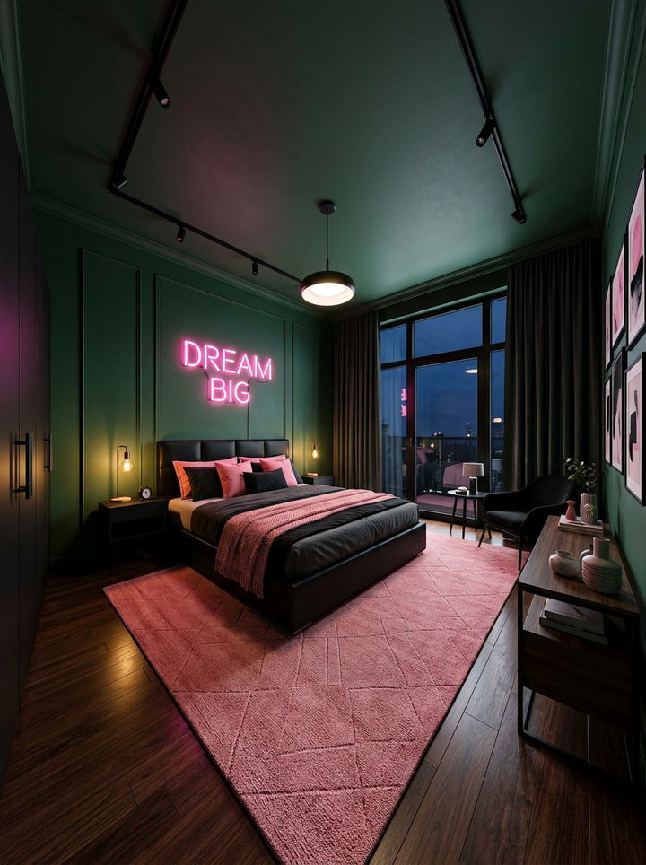
5. Forest green and hot pink bedroom
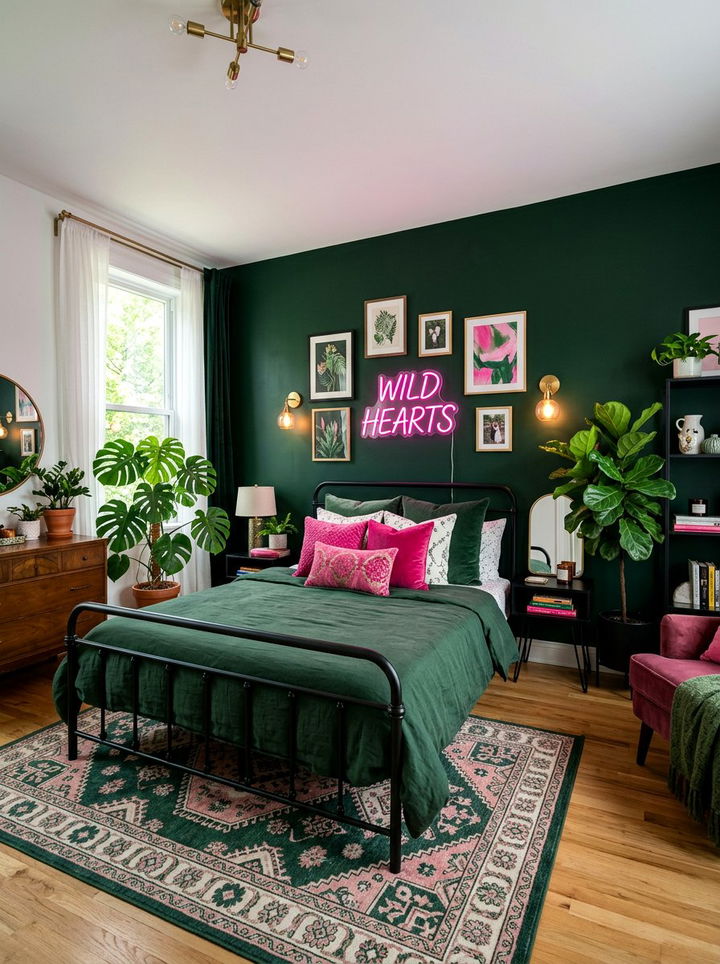
Forest green and hot pink create a high-contrast look that is bold and full of personality. This combination is perfect for a maximalist design style where you want to make a big statement. The deep, dark forest green provides a moody backdrop that allows the hot pink to pop vibrantly. You can use hot pink for decorative pillows, neon signs, or bold artwork on the walls. Forest green works well for large furniture items like a wardrobe or a plush armchair. This duo is energetic and modern, making it a great choice for a creative individual’s bedroom. Balancing these strong colors with some white or neutral accents can help to keep the space from feeling too busy or cluttered.
6. Pastel pink and lime green bedroom
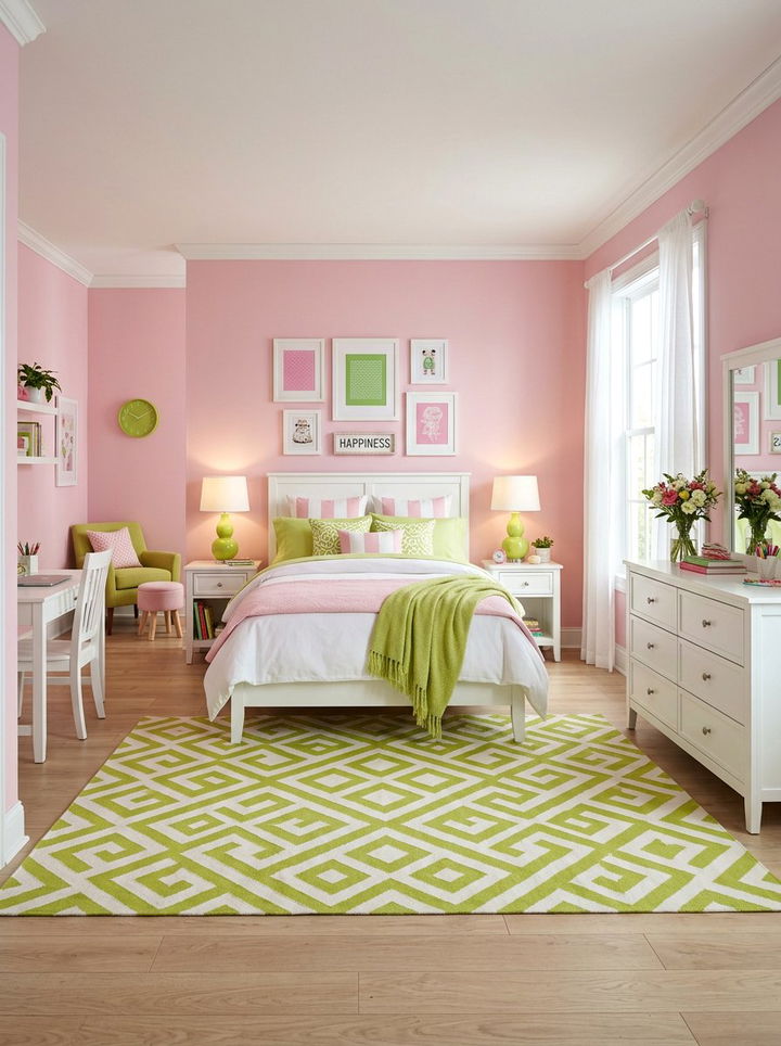
Pastel pink and lime green offer a citrusy and energetic vibe that feels youthful and fun. This color combo is great for a guest room or a teenager’s bedroom where you want a zesty atmosphere. The softness of the pastel pink tones down the sharpness of the lime green. You can use lime green in small doses, such as in a patterned wallpaper or a bedside lamp. Pastel pink can be the dominant color for the walls or the bedspread. This pairing looks best when combined with bright white trim and light-colored flooring. It creates a cheerful environment that is sure to start your day with a positive and upbeat mood. The contrast is sharp but remains very harmonious.
7. Dark green and pale pink bedroom

Dark green and pale pink provide a classic and elegant look that feels very balanced. The heaviness of the dark green is perfectly offset by the lightness of the pale pink. This creates a professional and polished appearance that suits many different home styles. You can apply dark green paint to all four walls for a cocoon-like feeling. Use pale pink for the ceiling or the bedding to lift the space and keep it from feeling too dark. This combination looks stunning with dark wood furniture and traditional architectural details like crown molding. It is a sophisticated way to use color without making the bedroom feel overly trendy. The result is a timeless space that feels both secure and delicate.
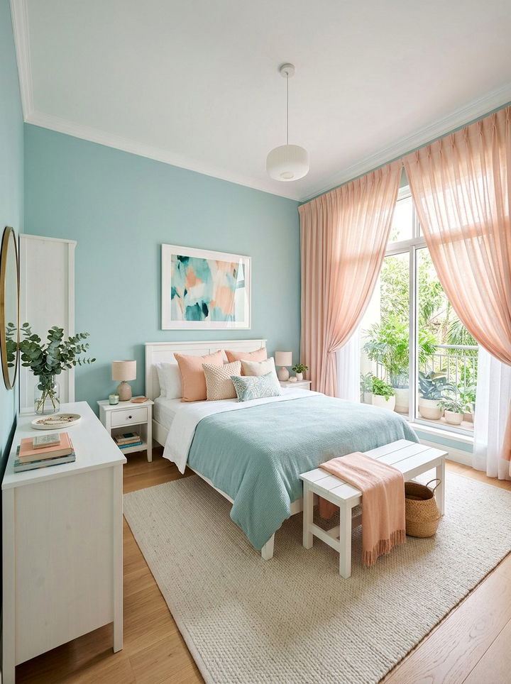
8. Seafoam green and peach pink bedroom
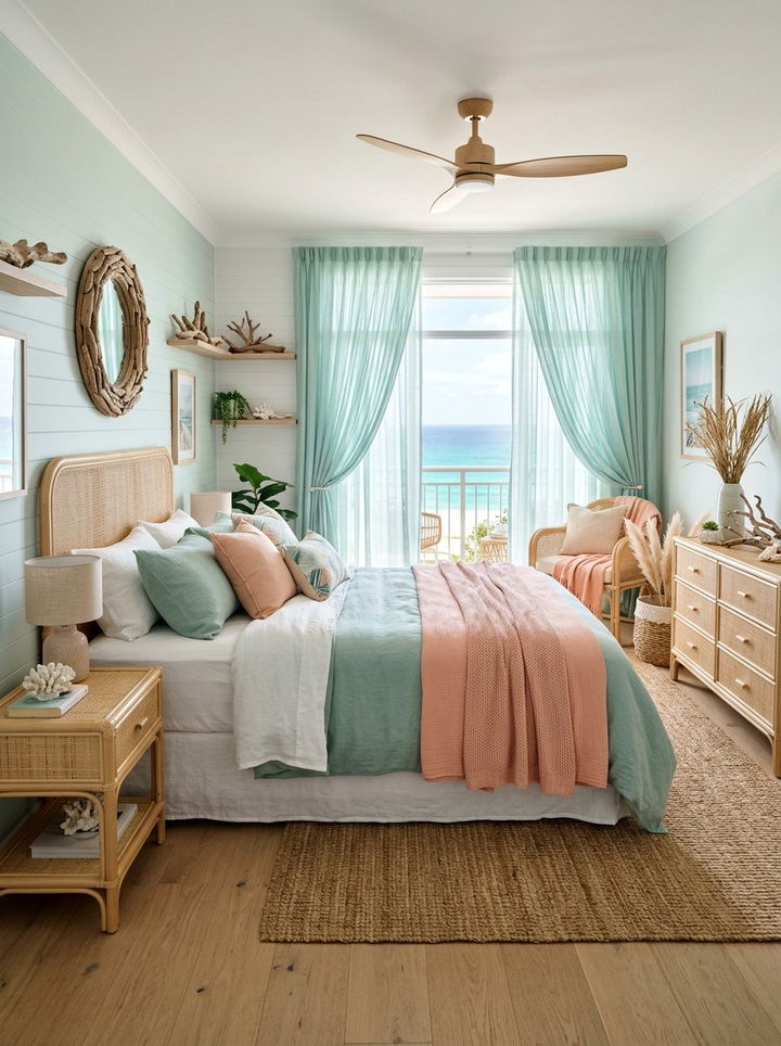
Seafoam green and peach pink create a coastal and breezy atmosphere that is very relaxing. This palette is reminiscent of a sunset at the beach, making it perfect for a tranquil bedroom. Seafoam green has a watery quality that promotes rest and rejuvenation. Peach pink adds a soft, warm glow that mimics natural light. You can use seafoam green for the window treatments to catch the light beautifully. Peach pink works well for a cozy throw blanket or a decorative bench at the foot of the bed. This combination is very gentle on the eyes and works well in rooms meant for pure relaxation. It pairs beautifully with light-colored woods and natural fibers like jute or rattan.
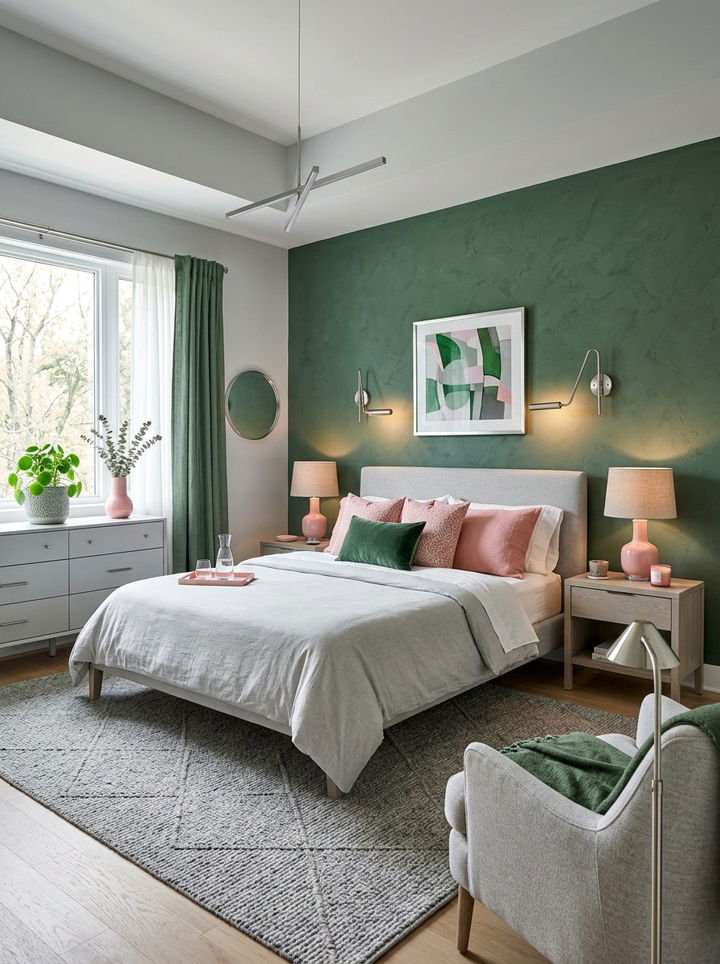
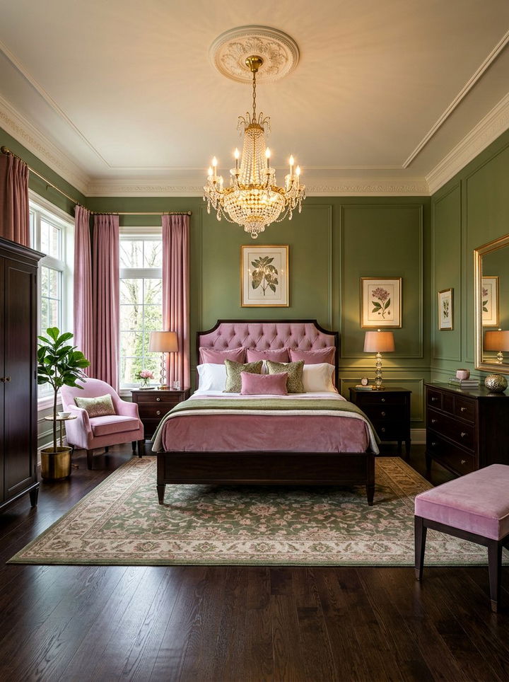
9. Hunter green and mauve bedroom
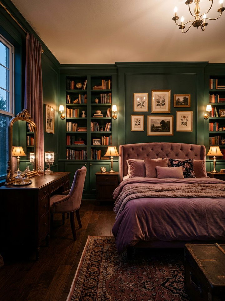
Hunter green and mauve offer a moody and romantic aesthetic that feels very intimate. Hunter green is a traditional and stately color that brings a sense of permanence to a room. Mauve is a dusty, purple-toned pink that adds a layer of mystery and softness. This pairing is excellent for creating a dramatic and cozy retreat. You can use hunter green for built-in shelving or a painted vanity. Mauve is a great choice for silk or satin bedding to add a touch of luxury. This color scheme thrives under warm, dim lighting which enhances the richness of both shades. It creates a space that feels sophisticated and deeply personal. It is a great alternative to more common color pairings.
10. Kelly green and bubblegum pink bedroom
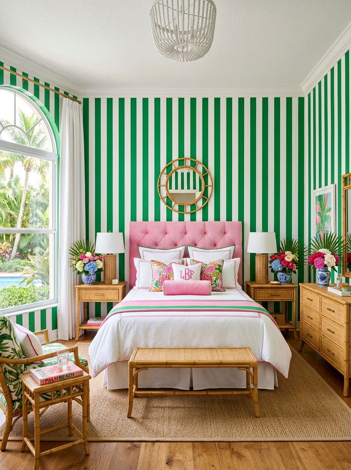
Kelly green and bubblegum pink create a preppy and vibrant look that is full of life. This combination is often seen in classic Palm Beach style interiors. Kelly green is a true, bright green that feels very lush and garden-like. Bubblegum pink is a cheerful and unapologetic shade that adds a sense of playfulness. You can use these colors in bold patterns like stripes, florals, or ikat prints. This pairing works best when anchored with plenty of crisp white accents to keep it looking clean. It is a fantastic choice for someone who loves color and wants their bedroom to feel like a permanent vacation. The high energy of this duo makes the room feel bright even on cloudy days.
11. Teal green and coral pink bedroom
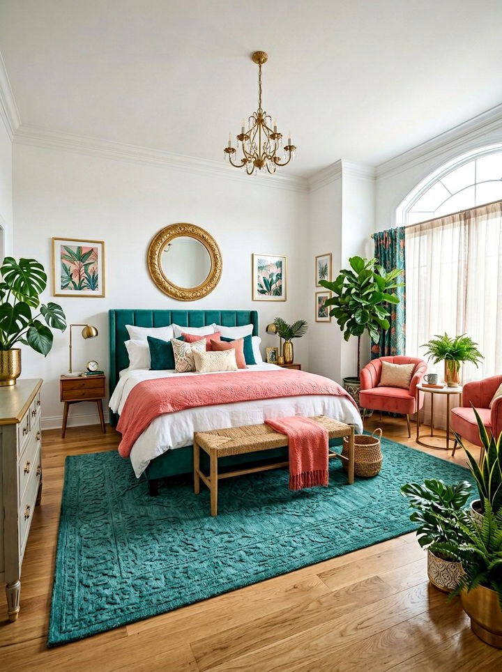
Teal green and coral pink offer a tropical and exotic vibe that feels very adventurous. Teal is a deep blue-green that provides a cool and steady base for the room. Coral pink is a warm and energetic accent that brings a splash of the ocean to your decor. You can use teal for a large area rug or the main curtains. Coral pink is perfect for accent chairs or decorative bowls and vases. This combination is visually stimulating and works well with gold accents and leafy green plants. It creates a bedroom that feels like a boutique hotel in a faraway destination. The balance between the cool teal and warm coral is naturally pleasing and very modern.
12. Neon green and magenta bedroom
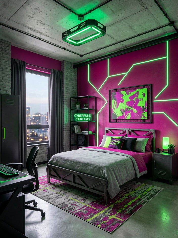
Neon green and magenta create a futuristic and high-energy space that is truly unique. This combination is for the brave decorator who wants a bedroom that stands out from the crowd. These electric shades work best in a modern or industrial setting with minimalist furniture. You can use magenta for a bold statement wall and neon green for smaller accessories like picture frames or cushions. This pairing looks best with black or dark grey accents to ground the intensity of the colors. It is a very creative and expressive palette that works well for a gaming room or a modern studio apartment. The contrast is extreme, creating a vibrant and pulse-pounding environment that is anything but boring.
13. Moss green and rose gold bedroom
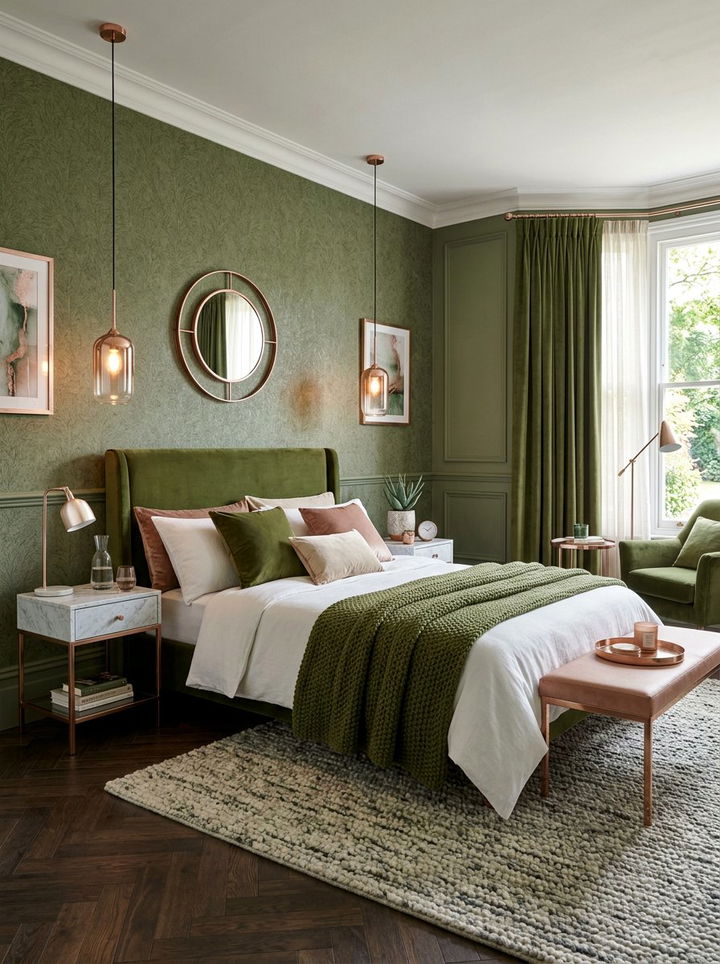
Moss green and rose gold offer a subtle and organic luxury that feels very contemporary. Moss green is a soft, muted tone that brings the feeling of a quiet forest indoors. Rose gold adds a metallic pink shimmer that provides a touch of elegance and glamor. You can use moss green for textured wallpaper or a soft wool rug. Rose gold is best used for lighting fixtures, drawer pulls, and picture frames. This combination is very calming and sophisticated, making it ideal for a master bedroom. The earthy green tones down the sweetness of the pink metallic, resulting in a balanced and mature look. It works beautifully with velvet fabrics and light-colored marble surfaces.
14. Jade green and salmon pink bedroom
Jade green and salmon pink create a vintage-inspired look that feels very artistic. Jade green has a rich, mineral quality that feels substantial and timeless. Salmon pink is a warm, orange-leaning pink that adds a cheerful and inviting glow. This pairing was popular in mid-century design and is currently seeing a major resurgence. You can use jade green for upholstered furniture or painted wooden pieces. Salmon pink works well for wall art or patterned bedding. This combination feels very curated and intentional, perfect for someone who loves collecting unique decor items. It pairs well with warm wood tones like teak or walnut. The result is a bedroom that feels storied, comfortable, and full of character.
15. Pistachio green and baby pink bedroom
Pistachio green and baby pink create a sweet and delicate atmosphere that is incredibly charming. This palette is soft and easy on the eyes, making it perfect for a nursery or a relaxing guest suite. Pistachio green is a light, nutty shade that feels fresh and airy. Baby pink is the ultimate soft accent that adds a sense of innocence and warmth. You can use these colors in a checkered or polka-dot pattern for a whimsical touch. This combination works best with white furniture and light-colored floors to maintain the bright and open feeling. It is a very classic and pretty pairing that never goes out of style. The softness of the hues ensures the room remains a peaceful place.
16. Pine green and cherry blossom pink bedroom
Pine green and cherry blossom pink offer a deep and delicate contrast that feels very natural. Pine green is a dark, cool-toned green that mimics the needles of an evergreen tree. Cherry blossom pink is a very light and airy shade that provides a beautiful highlight. You can use pine green for the lower half of a wall with wainscoting and the pink for the upper half. This creates a grounded yet lifted feeling in the room. This combination is excellent for a room with large windows that look out onto a garden. It feels very peaceful and encourages a deep sense of rest. The contrast between the dark pine and the light pink is both striking and harmonious.
17. Chartreuse and flamingo pink bedroom
Chartreuse and flamingo pink create a bold and eclectic look that is very fashionable. Chartreuse is a unique yellow-green that is eye-catching and vibrant. Flamingo pink is a bright and tropical shade that complements the intensity of the green. This pairing is perfect for a bedroom with a lot of personality and artistic flair. You can use chartreuse for a velvet headboard and flamingo pink for a patterned rug. This combination looks great with black and white photography or graphic art prints. It is a high-fashion choice that feels very current and exciting. The key to making this work is to use large blocks of color and keep the rest of the decor relatively simple.
18. Army green and peony pink bedroom

Army green and peony pink offer a utilitarian yet feminine aesthetic that is very modern. Army green is a flat, matte shade that feels tough and grounded. Peony pink is a lush and full-bodied pink that adds a necessary layer of softness and beauty. This combination is great for creating a “tough-luxe” look in a bedroom. You can use army green for a metal bed frame or painted nightstands. Peony pink works beautifully for heavy silk curtains or a floral duvet cover. This pairing is unexpected and very stylish, appealing to those who like to mix different design languages. It feels very balanced and sophisticated, providing a unique twist on the traditional pink and green theme.
19. Grass green and strawberry pink bedroom
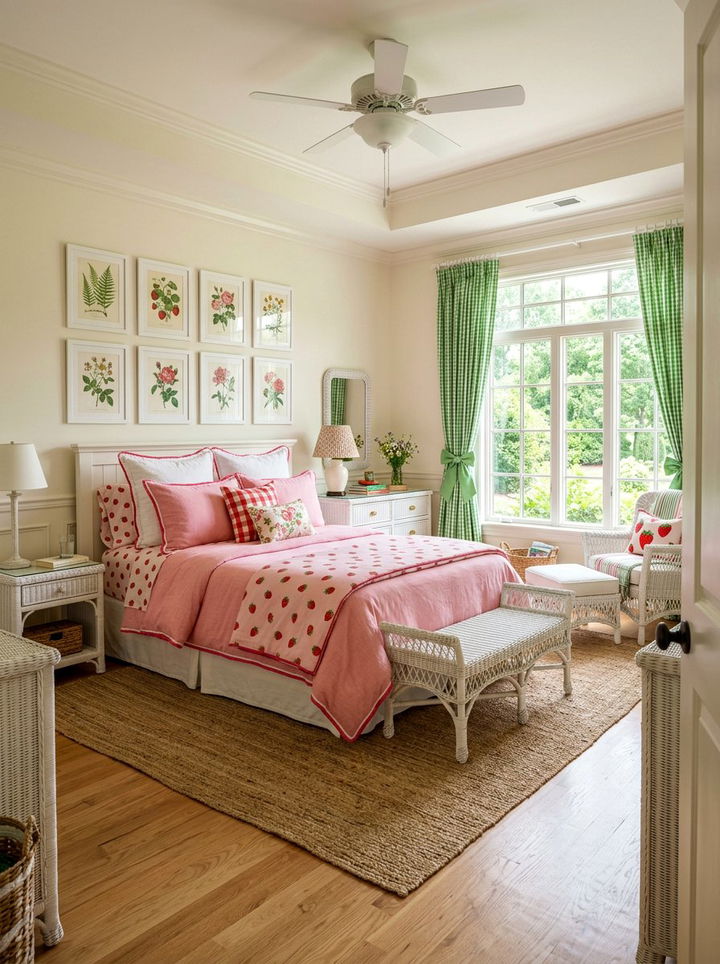
Grass green and strawberry pink create a preppy and wholesome look that feels very classic. This combination is reminiscent of traditional country club decor or a well-kept summer garden. Grass green is a vibrant and healthy shade that brings a lot of energy to the space. Strawberry pink is a sweet and fruity accent that adds a sense of joy. You can use these colors in classic prints like toile, gingham, or stripes. This pairing looks best with white-painted furniture and natural wicker accents. It is a very cheerful and welcoming palette that makes a bedroom feel like a happy retreat. The colors are bright and clear, creating a very clean and organized appearance.
20. Bottle green and fuchsia pink bedroom
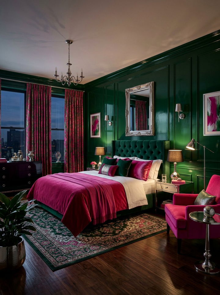
Bottle green and fuchsia pink offer a dark and dramatic palette that is incredibly rich. Bottle green is a very dark, translucent-looking green that provides a lot of depth. Fuchsia pink is a saturated and powerful shade that cuts through the darkness of the green. This combination is perfect for a glamorous and moody bedroom. You can use bottle green for lacquered furniture or silk wall coverings. Fuchsia pink is a great choice for a plush area rug or a statement velvet chair. This pairing looks stunning under low, moody lighting with silver or chrome accents. It is a high-contrast and high-impact choice that feels very luxurious and daring. It creates an atmosphere of nighttime elegance.

21. Celadon green and powder pink bedroom
Celadon green and powder pink create a quiet and ethereal space that feels very sophisticated. Celadon is a pale, grey-green that has a ceramic-like quality. Powder pink is a very light and dusty shade that is almost a neutral. This combination is perfect for a minimalist bedroom where you want a hint of color without it being distracting. You can use celadon for the walls and powder pink for the bedding and textiles. This palette works beautifully with light ash wood and matte white finishes. It is a very calming and intellectual color scheme that promotes clear thinking and deep sleep. The subtlety of the hues makes the room feel very expansive and light-filled.
22. Fern green and carnation pink bedroom
Fern green and carnation pink offer a leafy and floral aesthetic that feels very organic. Fern green is a medium-toned, natural green that looks like forest foliage. Carnation pink is a bright and clear pink that mimics the petals of a flower. This combination is great for a nature lover’s bedroom. You can use fern green for botanical print wallpaper and carnation pink for solid-colored accents. This pairing feels very balanced and brings the beauty of the outdoors inside. It works well with wooden furniture and plenty of actual indoor plants. The result is a space that feels alive and healthy, providing a perfect environment for waking up feeling refreshed and energized.
23. Viridian green and watermelon pink bedroom
Viridian green and watermelon pink create a vibrant and summery look that is very refreshing. Viridian is a bright, bluish-green that feels very modern and cool. Watermelon pink is a juicy and warm shade that adds a lot of personality. This combination is perfect for a guest bedroom or a sunroom-turned-bedroom. You can use viridian for the window frames or a painted floor. Watermelon pink works well for large-scale artwork or colorful bedding. This pairing is very energetic and works best with plenty of white space to let the colors breathe. It feels very youthful and creative, making it a great choice for anyone who loves a bright and colorful home.
24. Juniper green and taffy pink bedroom
Juniper green and taffy pink offer a cool and sweet contrast that is very unique. Juniper is a dusty, blue-toned green that feels very crisp and clean. Taffy pink is a bright and sugary shade that provides a fun pop of color. This combination is excellent for a modern bedroom with a slight retro feel. You can use juniper for a textured accent wall and taffy pink for bedside accessories. This pairing looks great with light grey or silver accents to maintain the cool undertones. It is a very trendy and fresh choice that feels sophisticated yet playful. The contrast between the dusty green and the bright pink is visually interesting and very memorable.
25. Pear green and crepe pink bedroom
Pear green and crepe pink create a soft and fruity palette that is very inviting. Pear green is a light, yellow-leaning green that feels very sunny and optimistic. Crepe pink is a delicate and crinkly-textured pink that adds a touch of elegance. This combination is perfect for a light-filled bedroom with a lot of windows. You can use pear green for the curtains to filter the sunlight into a warm glow. Crepe pink works well for upholstered headboards or soft throw pillows. This pairing feels very gentle and happy, making it a great environment for a morning person. It pairs beautifully with light-toned woods and brass hardware for a warm and finished look.

26. Artichoke green and orchid pink bedroom
Artichoke green and orchid pink offer a muted and sophisticated look that feels very high-end. Artichoke green is a greyish, earthy green that acts as a beautiful neutral. Orchid pink is a slightly purple-toned pink that adds a layer of luxury and depth. This combination is perfect for a master suite that needs to feel calm yet decorated. You can use artichoke green for the main wall color and orchid pink for velvet textiles. This pairing looks stunning with dark furniture and crystal lighting fixtures. It is a very mature and polished way to use pink and green together. The result is a bedroom that feels like a quiet sanctuary in a busy world.
27. Basil green and lemonade pink bedroom
Basil green and lemonade pink create a herbal and zesty atmosphere that is very refreshing. Basil green is a deep, warm green that feels very natural and aromatic. Lemonade pink is a light, sunny pink with a hint of yellow. This combination is great for a kitchen-adjacent bedroom or a studio apartment. You can use basil green for shelving or a small desk area. Lemonade pink works well for the bedspread and window coverings. This pairing feels very healthy and upbeat, perfect for someone who enjoys a clean and organized lifestyle. It works well with light-colored tile floors and natural wood accents. The colors are clear and bright, providing a very positive energy.
28. Laurel green and shell pink bedroom
Laurel green and shell pink offer a classic and Roman-inspired aesthetic that is very elegant. Laurel green is a soft, dusty green that feels very timeless and stately. Shell pink is a very light, iridescent-looking pink that adds a touch of glamor. This combination is perfect for a bedroom with traditional architectural details like columns or molding. You can use laurel green for long, flowing drapery and shell pink for silk pillows and bedding. This pairing looks best with gold leaf accents and marble-topped furniture. It is a very sophisticated and calm color scheme that feels very expensive and well-curated. The subtlety of the tones creates a very peaceful and high-class environment.
29. Myrtle green and punch pink bedroom
Myrtle green and punch pink create a dark and energetic look that is very stylish. Myrtle green is a deep, cool-toned green that provides a very moody base. Punch pink is a bright and saturated shade that adds a lot of excitement. This combination is perfect for a small bedroom where you want to embrace the darkness with a pop of color. You can use myrtle green for all the walls and the ceiling for a dramatic effect. Punch pink works well for a statement rug or a large piece of modern art. This pairing looks great with black furniture and neon lighting. It is a very brave and fashionable choice that feels very current and exciting.
30. Sage green and rose quartz bedroom
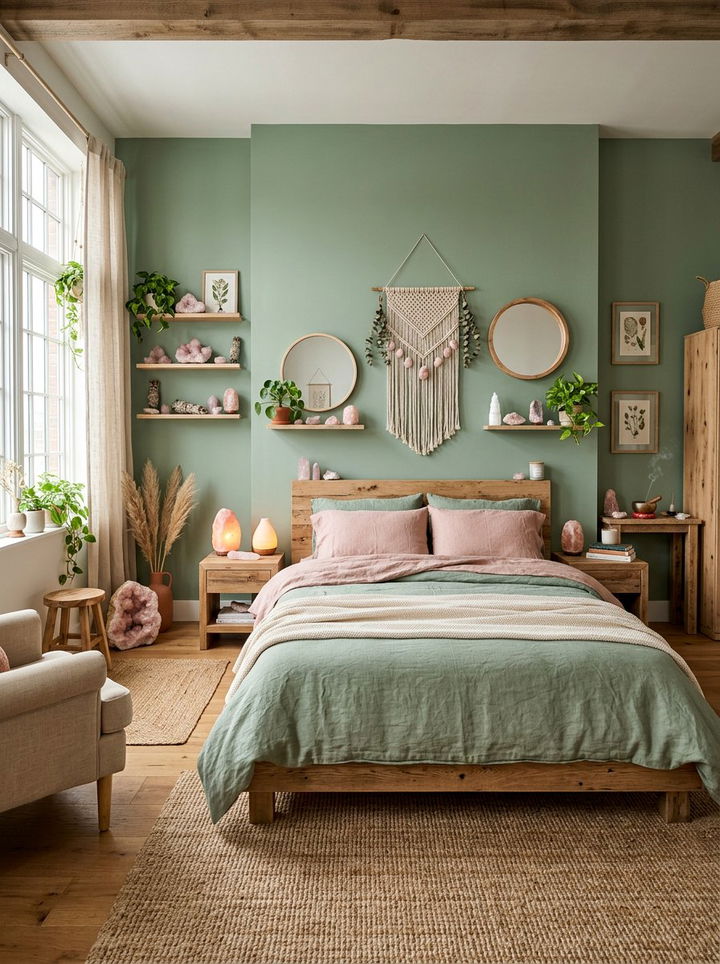
Sage green and rose quartz offer a crystal-inspired and spiritual aesthetic that is very calming. Sage green is an earthy and cleansing color that promotes peace. Rose quartz is a soft, mineral pink that is associated with love and healing. This combination is perfect for a bedroom meant for meditation and deep rest. You can use sage green for the walls and actual rose quartz crystals as decor items. This pairing works beautifully with natural materials like linen, stone, and raw wood. It is a very gentle and nurturing color scheme that helps to reduce stress and anxiety. The result is a space that feels like a personal spa, perfect for winding down at night.
Conclusion:
The combination of pink and green in a bedroom offers a unique balance of energy and tranquility that few other pairings can achieve. Whether you choose the moody sophistication of emerald and rose or the playful charm of mint and blush, these colors work together to create a space that feels curated and intentional. By varying the saturation and tone, you can adapt this palette to suit any design style, from ultra-modern to traditionally classic. Remember to consider your natural lighting and furniture textures to ensure the colors harmonize perfectly. Using these thirty ideas as your starting point, you can confidently design a bedroom that is not only visually stunning but also a true reflection of your personal style. Transforming your sleep space with these complementary hues will provide a refreshing sanctuary that you will enjoy for many years to come.
Related posts: